Sweet Claude’s
Brand Redesign Proposal
Project Overview
Sweet Claude’s is a family-owned ice cream shop known for its strong community presence and nostalgic charm.
For this project, I developed a comprehensive brand redesign that modernizes the visual and verbal identity while preserving the qualities that make the brand feel familiar and welcoming.
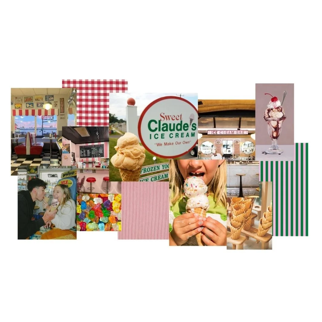
Created as part of my graduate Visual Design course at Quinnipiac University, the goal was to build a cohesive brand system grounded in research, storytelling, and community insight.
The Problem
Sweet Claude’s has an established identity and loyal customer base, but its branding lacks consistency and does not fully reflect the quality and experience the business provides.
Key challenges include:
An inconsistent visual identity across touchpoints
Limited brand guidelines to support cohesive communication
A lack of clear messaging to define what sets the brand apart
An opportunity to better balance nostalgia with a more modern presentation
The challenge was to evolve the brand without losing the sense of familiarity that customers value.
The Approach
I approached this project by combining brand strategy with visual design, ensuring that every element works together to create a cohesive identity.
Key Components Included:
Developing a clear brand story rooted in the origin of the name
Defining brand values centered on community, quality, and connection
Establishing a consistent tone of voice and style of language
Creating messaging that reflects both warmth and authenticity
This strategic foundation guided the development of the visual identity.
The Solution
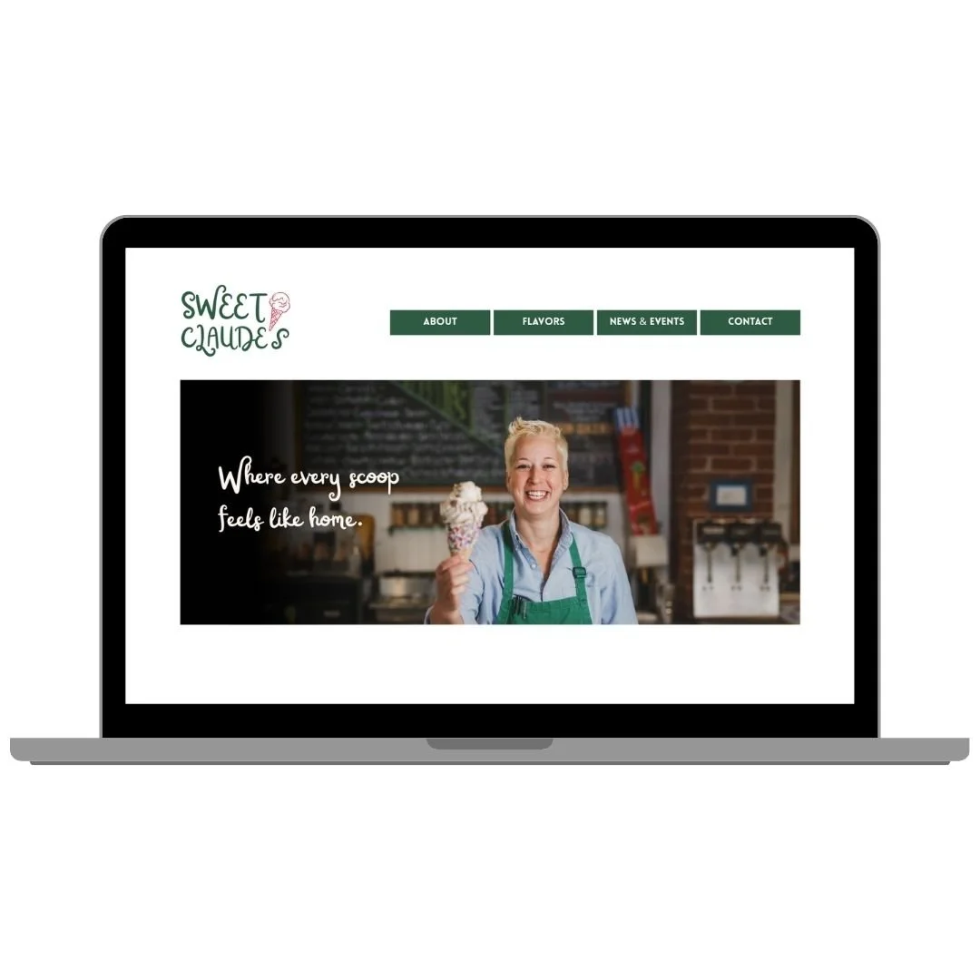
The final brand system balances tradition with a refreshed, modern feel.
Key elements include:
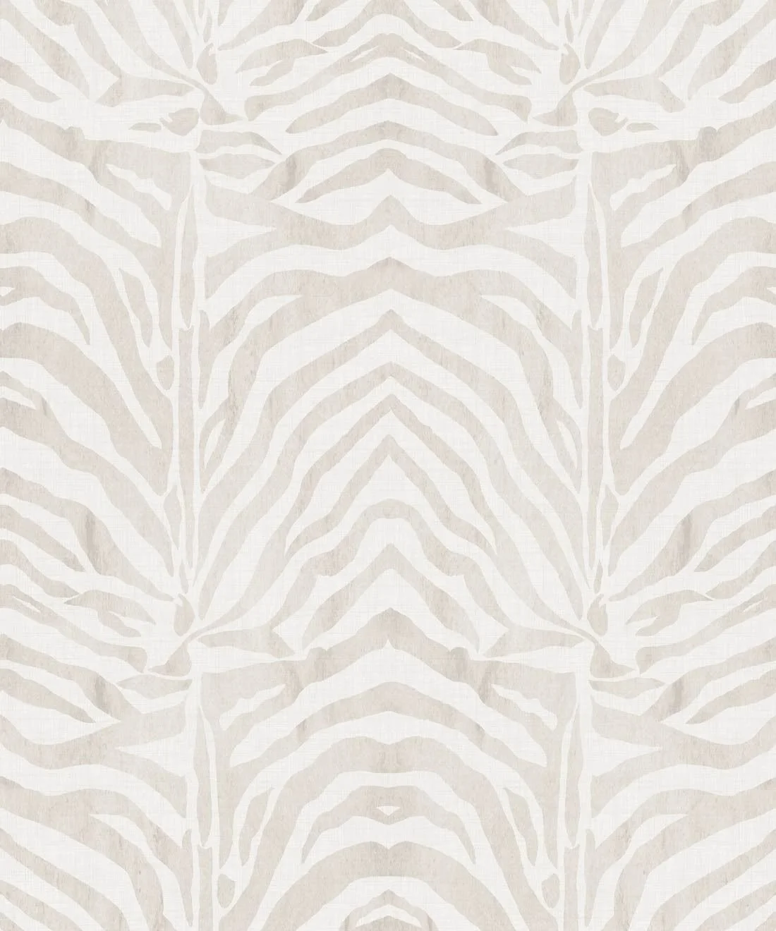
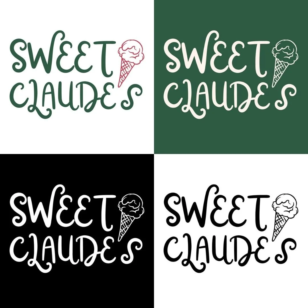
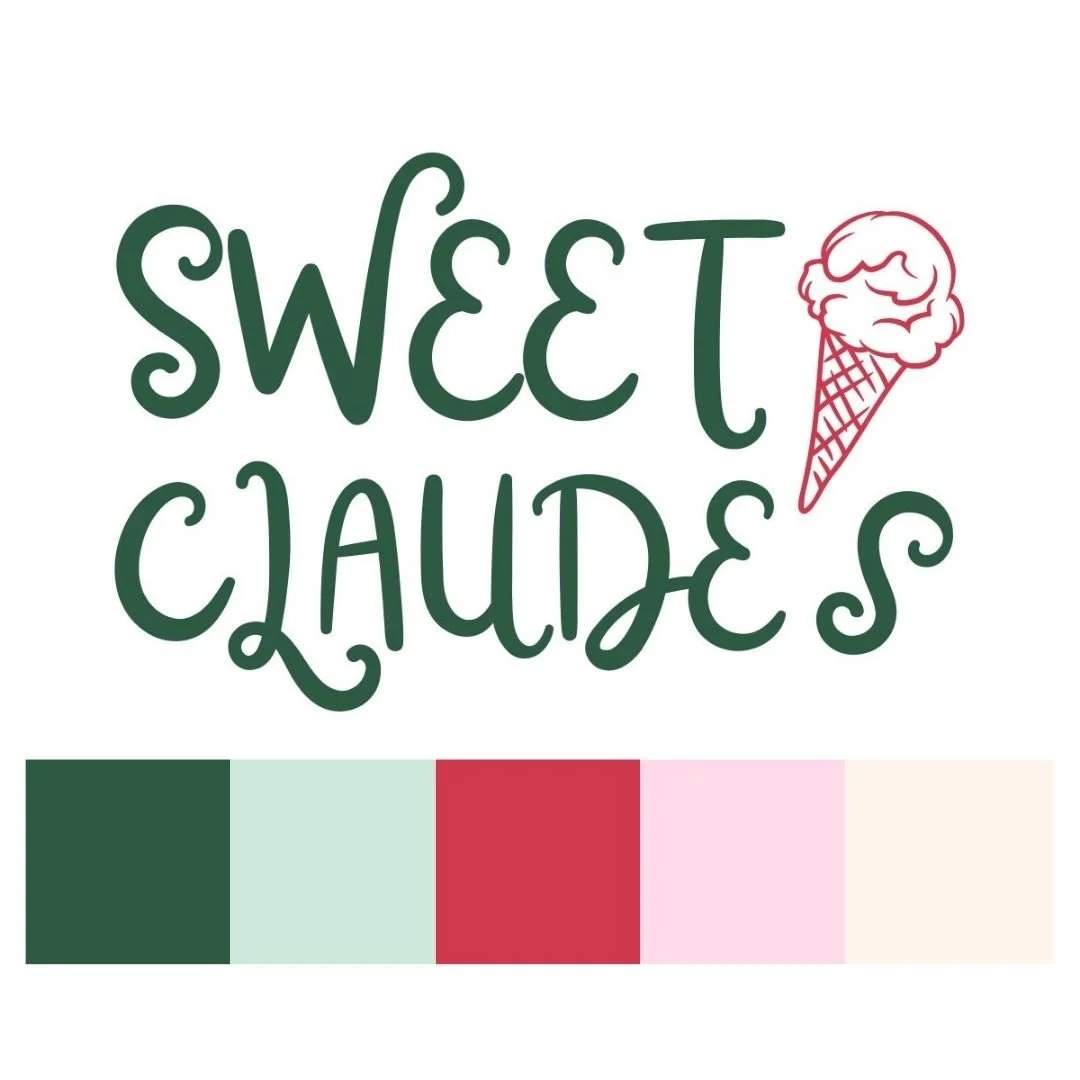
Visual Identity: A refined color palette featuring dark green and deep red to represent tradition and reliability (and to stay true to the history of the brand), paired with lighter accent colors to introduce warmth and approachability
Typography: A fun, yet readable script font paired with subtle character to maintain a handcrafted feel
Brand Voice and Feel: Clear, welcoming, and community-focused messaging
Design Direction: A cohesive system that can be applied across digital, print, and in-store materials
Each element is designed to feel consistent, recognizable, and adaptable across different brand touchpoints.
Key Takeaway
This project reflects my ability to connect brand strategy and visual design to create a cohesive identity system.
It also highlights my approach to balancing research, storytelling, and design — ensuring that branding is not only visually strong, but also meaningful and aligned with the audience.