Personal Brand
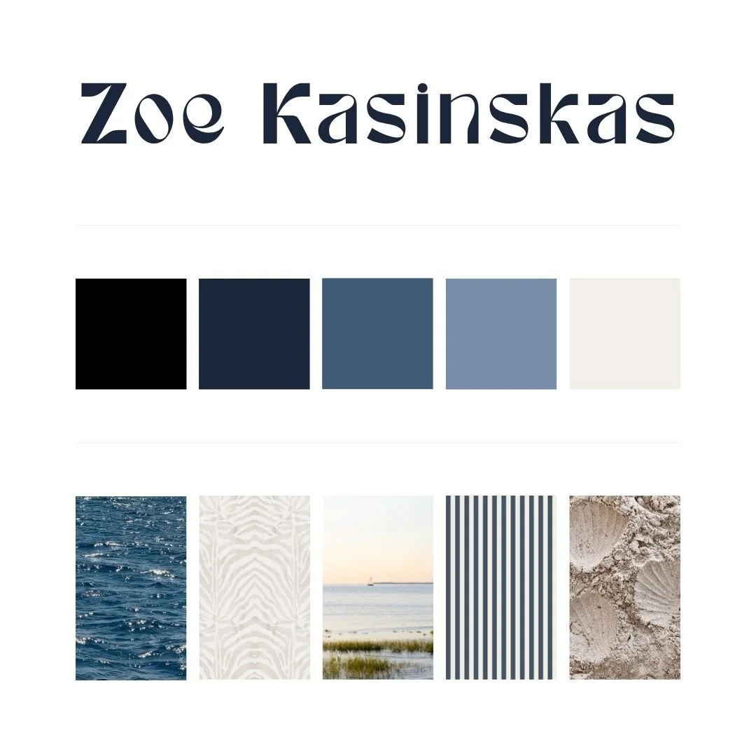
Brand Guide
Project Overview
For this project, I developed a personal brand identity system to support my work across digital and print platforms.
The goal was to create a brand that feels clean, cohesive, and adaptable while reflecting both my professional focus and personal influences. This included logo design, color palette development, typography selection, and the creation of a brand style guide.
The final system serves as a foundation for my portfolio, resume, and overall visual presence.
The Problem
As I began refining my portfolio and professional materials, I needed a consistent visual identity that could unify my work.
Key challenges included:
Creating a brand that feels professional without being overly generic
Maintaining consistency across multiple platforms and deliverables
Balancing personal style with a clean, adaptable design system
Establishing clear guidelines for future content and design work
Without a defined system, visual inconsistency can weaken overall brand perception.
The Approach
I approached this project by building a flexible identity system that could scale across different formats and use cases.
Key components included:
Designing a clean, recognizable wordmark as the primary logo
Creating a submark for use in smaller or secondary applications
Developing a cohesive color palette with both functional and expressive value
Selecting typefaces that prioritize readability and versatility
Building a structured brand board to guide consistent implementation
The focus was on simplicity, clarity, and long-term usability.
The Solution
The final brand identity is minimal, cohesive, and adaptable across platforms.
Logo System:
Primary wordmark featuring my name in a distinctive, modern type style
Submark using my initials (“ZK”) for flexible application across formats
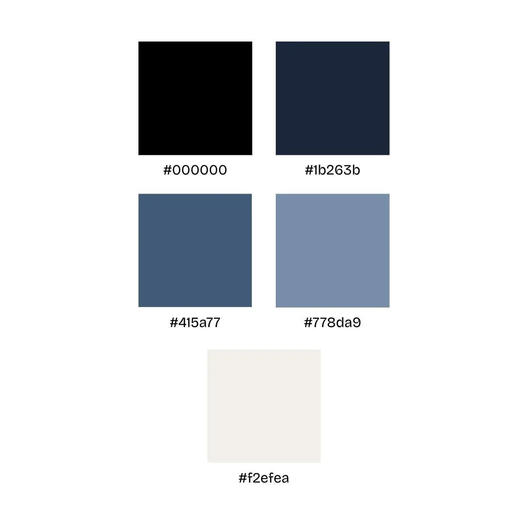
Color Palette:
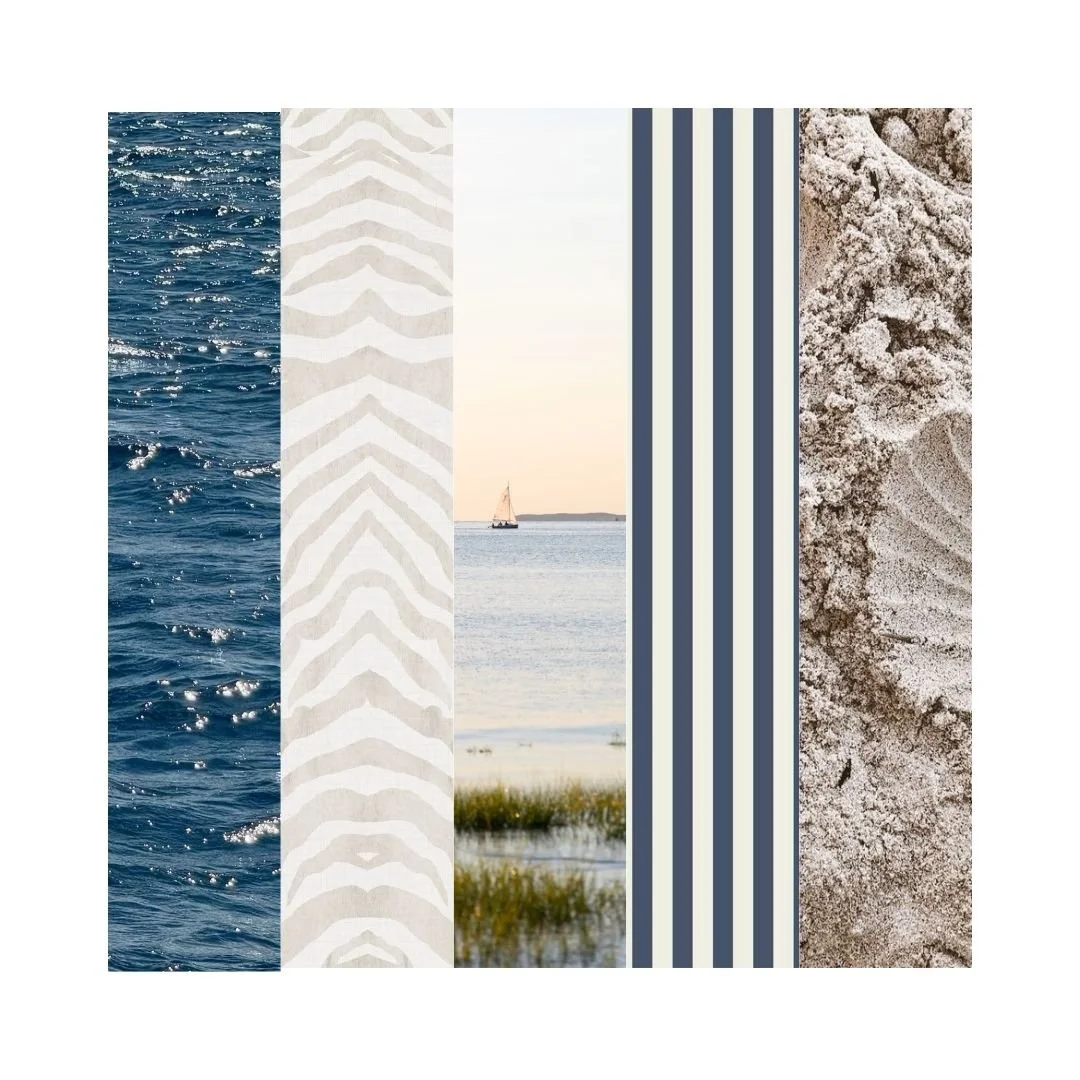
A range of neutral and blue tones, including black, navy, and softer coastal-inspired hues
Colors selected to convey trust, stability, and clarity, while maintaining a personal connection to the ocean
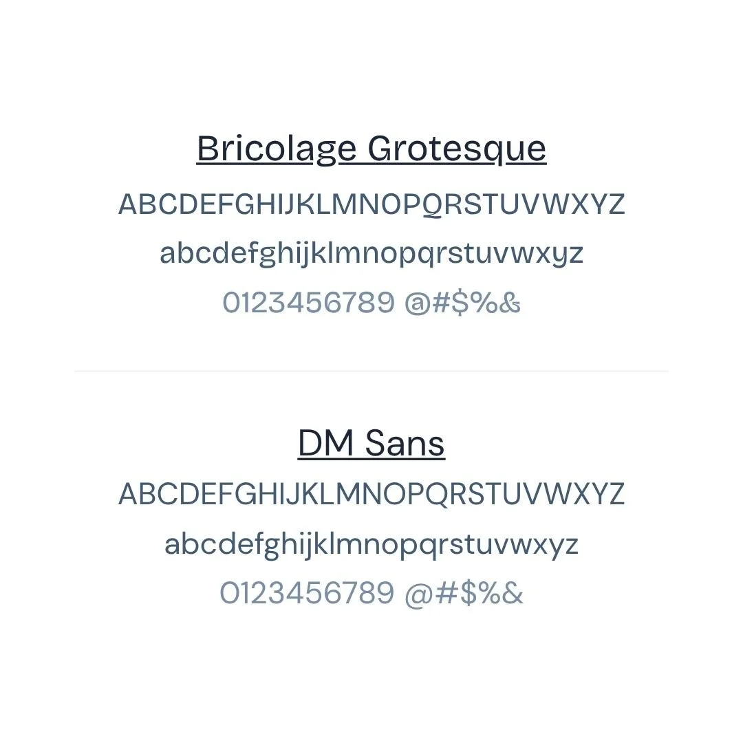
Typography:
Bricolage Grotesque for headings
DM Sans for body copy
Both typefaces selected for readability, versatility, and a clean, modern feel
Visual Direction:
Clean, minimal layouts with subtle personality
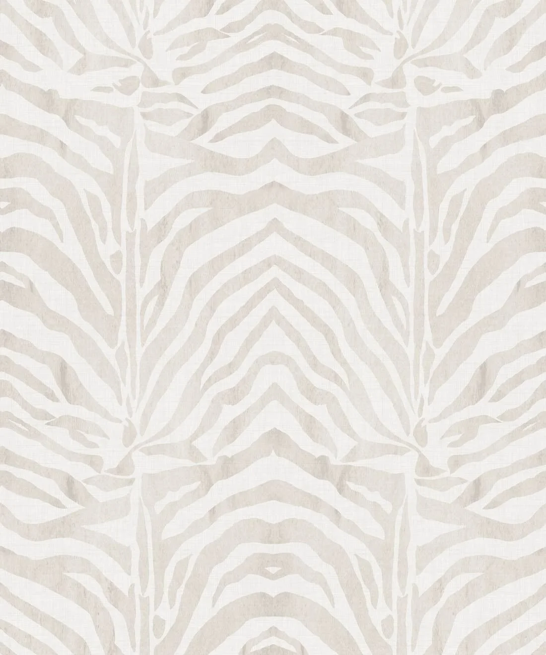
Inspiration drawn from coastal elements and zebra print patterns
A balance between structure and individuality to support a wide range of content
Key Takeaway
This project reflects my ability to build a cohesive brand system from the ground up, combining visual design with strategic thinking.
It also serves as the foundation for how I present my work, ensuring consistency, clarity, and a strong visual identity across everything I create.