
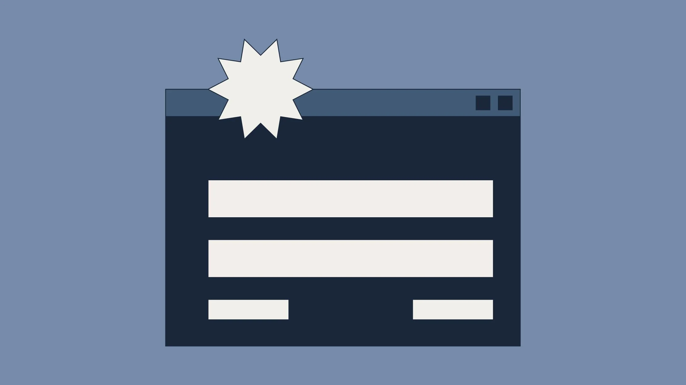
How to Structure a Landing Page That Actually Converts
By Zoe Kasinskas
If you’ve ever clicked on an ad, signed up for something, or downloaded a resource, chances are you landed on a page designed to get you to take a specific action. That’s exactly what a landing page is built to do.
Unlike a homepage, which encourages exploration, a landing page has one goal: conversion. Whether that’s filling out a form, signing up for a service, or making a purchase, every element on the page should guide the user toward that action.
So what actually makes a landing page work?
Start With One Clear Goal
Before anything else, a landing page needs a single, focused objective. Pages that try to do too much — promote multiple offers, include too many links, or send users in different directions — often struggle to convert.
A strong landing page removes distractions and keeps the user focused on one action. This clarity makes it easier for visitors to understand what to do next and increases the likelihood that they’ll follow through.
Hook Attention With a Strong Headline and Visual
The top of your landing page (often called “above the fold”) is the most important section. This is where users decide whether they’ll stay or leave.
Start with a clear, benefit-driven headline that immediately communicates what the user will get. Supporting subheadings can add context, but the main message should be obvious within seconds.
Pair this with a strong visual, like a hero image or short video, that helps users quickly understand your offer. Visuals are processed faster than text, so they play a key role in making a strong first impression.
Communicate Value With Clear, Scannable Content
Once you’ve captured attention, you want to sustain it.
Landing page content should be easy to scan and focused on benefits. Instead of long paragraphs, use short sections, bullet points, and clear headings to guide the reader through the page.
It’s also important to highlight why your offer matters. Features explain what something is, but benefits explain how it helps the user. Leading with benefits makes your messaging more persuasive and relevant.
If you want to go deeper on how strong messaging impacts performance, you can connect this back to your previous blog on high-performing website content.
Make Your Call to Action Impossible to Miss
Your call to action (CTA) is the most important element on the page. It’s where conversion actually happens.
A strong CTA should:
Use clear, action-oriented language (e.g., “Download Now” or “Start Your Free Trial”)
Stand out visually on the page
Appear early (above the fold) and be repeated throughout
Forms should also be simple and easy to complete. The more fields you require, the more friction you create — and the more likely users are to drop off before converting.
Build Trust With Social Proof
Even if your offer is strong, users may hesitate if they’re unsure whether they can trust it.
Including testimonials, reviews, case studies, or recognizable brand logos helps reinforce credibility and reduce doubt. When users see that others have had a positive experience, they’re more likely to feel confident taking the next step.
This is especially important for higher-commitment actions like signing up for a service or making a purchase.
Keep the Design Clean and Focused
A high-converting landing page is intentional.
Removing unnecessary navigation, limiting external links, and keeping the layout simple all help keep users focused on the goal. Every element on the page should support the conversion, not distract from it.
A clean design also improves readability and makes it easier for users to process information quickly.
Don’t Forget Performance and Mobile Experience
Even the best-designed landing page won’t convert if it doesn’t perform well.
Slow load times, poor mobile design, or difficult-to-use forms can quickly drive users away. Today, a large portion of traffic comes from mobile devices, so your page needs to be responsive, fast, and easy to navigate on smaller screens.
Small improvements in speed and usability can have a big impact on conversion rates.
Test, Learn, and Improve
One of the most important things to remember is that landing pages are never “done.”
Testing different headlines, visuals, layouts, or CTA placements can reveal what resonates most with your audience. Even small changes like adjusting button text or simplifying a form can lead to meaningful improvements.
Over time, these optimizations can significantly increase conversions and overall performance.
Final Thoughts
When you:
Start with one clear goal
Guide users with strong messaging and visuals
Reduce friction and distractions
Build trust and credibility
… you create a page that doesn’t just look good. You create a page that converts.
At the end of the day, the best landing pages make it easy for users to understand what they’re getting and even easier to say yes.
04/13/26